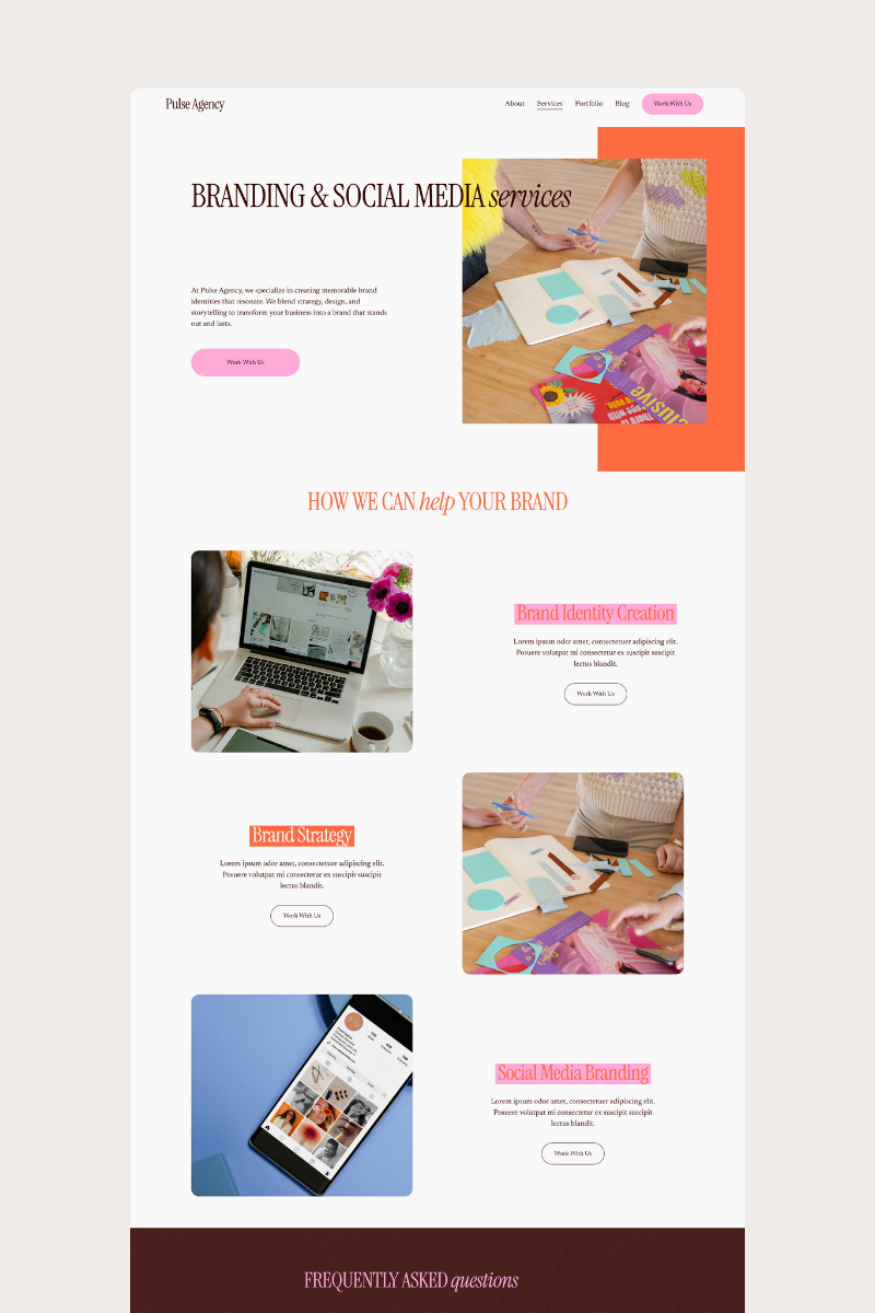
Is Your Website Secretly Losing Clients? Here’s How to Tell.
Most DIY website owners assume that if their site looks good, it’s doing its job.
But the hard truth?
A pretty website can still be a conversion killer — especially on Squarespace.
If your website isn’t bringing in inquiries, bookings, or sales, it’s not always because you need a rebrand or more traffic.
Often, it’s because small issues are quietly sending visitors away before they ever get to know you.
Here are the most common silent website problems — and how to fix them fast.
1. Your Navigation Has More Than 6 Items
Your navigation is the very first moment your visitor decides whether to stay… or leave.
When your menu has 7, 8, even 10+ items, it instantly feels overwhelming.
Visitors don’t know where to click, so they click the easiest option:
The back button.
Fix this:
Keep 5–6 top-level links max
Move less-important pages to your footer
Group things under dropdowns (example: “About” → “Meet the Founder,” “Our Story”)
A clean menu feels intentional, modern, and trustworthy.
2. Your Homepage Doesn’t Say What You Do in 3 Seconds
Visitors aren’t patient. They skim — fast.
If your hero section doesn’t clearly answer:
“What do you do?”
“Who is it for?”
“Why does it matter?”
…you’ve already lost them.
Fix this:
Use a simple, high-clarity headline like:
“Squarespace Templates for Modern Entrepreneurs.”
or
“Brand Photography for Coaches + Small Businesses.”
Then add a short subheadline and one clear button.
3. Your Photos Don’t Follow One Visual Style
This is one of the easiest ways to make your brand look messy and low-budget.
When half your photos are warm, others are cool, some are dark, some are light, and some have totally different vibes…
Consumers feel it immediately.
Fix this:
Choose one aesthetic (light + airy, bold + editorial, natural + organic, etc.)
Stick to the same editing style
Limit yourself to 3–5 brand photos you use everywhere
Consistency makes your brand look instantly more premium.
4. Your Button Text Is Vague or Confusing
“Learn More” isn’t a call to action.
“Click Here” is even worse.
People will not click something if they’re unsure what happens next.
Fix this:
Use action-focused, outcome-focused button text like:
Shop Templates
Book Your Session
Start Your Project
Get Instant Access
Explore Services
Clear buttons = higher conversions.
5. Your Fonts Don’t Match Your Brand Voice
Your typography says more than you think.
The wrong style instantly creates a “something feels off” reaction.
Examples:
A playful script on a luxury brand = mismatch
A harsh, bold font on a wellness site = mismatch
Too many different fonts = amateur vibes
Fix this:
Choose:
✔ 1 header font
✔ 1 body font
✔ 1 accent font (optional)
Keep it simple. Keep it consistent.
6. Your Site Has No Visual Hierarchy
Visitors should be able to skim your website and know exactly where to look first.
If every section is the same size, same color, same weight… people get lost.
Fix this:
Make headlines larger than body text
Use spacing to guide the eye
Use accent color sparingly for important CTAs
Break text into short paragraphs + bullets
Good hierarchy = effortless reading.
7. You’re Making People Work Too Hard
If visitors have to scroll endlessly, decipher unclear sections, or guess what you offer, they won’t stay.
Attention spans are short — the website experience has to feel easy.
Fix this:
Keep sections short
Use helpful headlines
Add buttons throughout the page
Keep your message consistent
Your website isn’t just a portfolio — it’s a path that leads users to action.
The Good News? These Fixes Are Easy.
Most websites aren’t broken — they’re just not optimized.
A few smart changes can turn your Squarespace site into a clean, strategic, high-converting machine.
And if you want the shortcut?
✨ Our templates already fixes all these issues for you — clean navigation, clear messaging, strong hierarchy, intentional photos, and conversion-ready calls to action.
You don’t have to guess.
You don’t have to DIY everything from scratch.
You just plug in your content and launch with confidence.


