5 Common Mistakes DIYers Make on Squarespace 7.1 (and How to Fix Them)
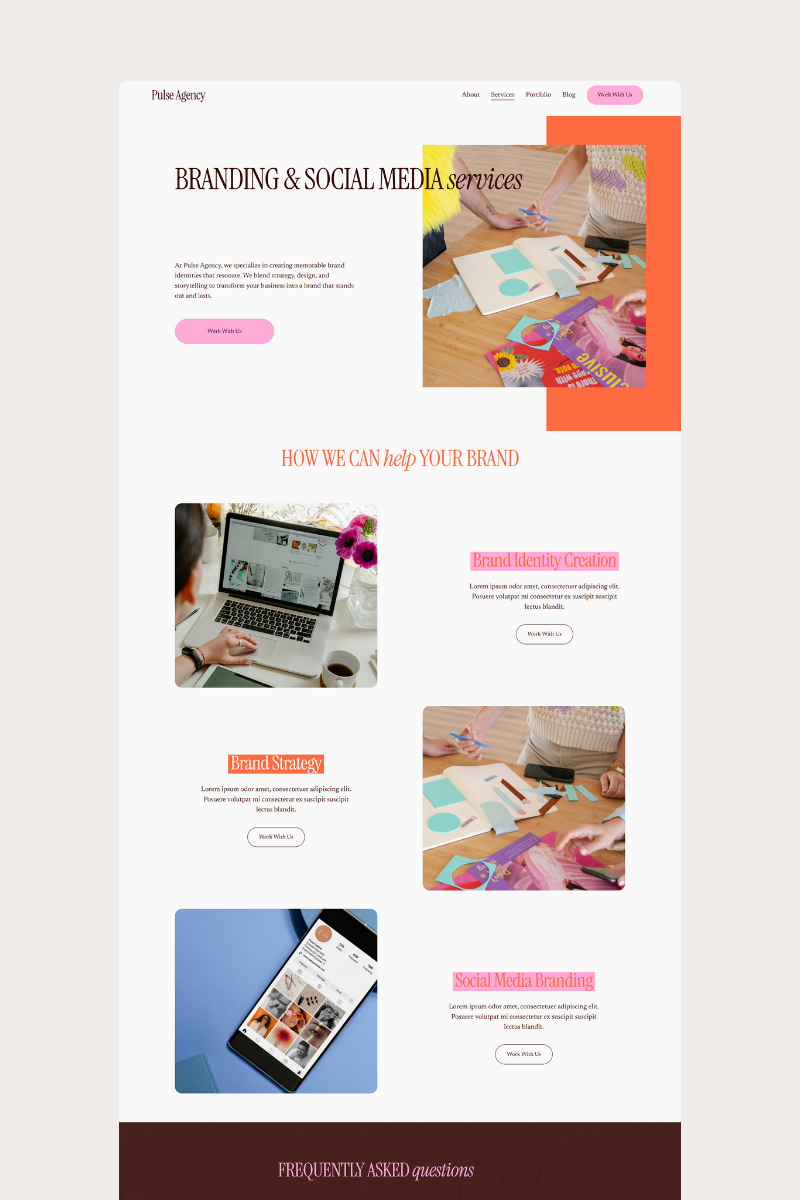
If you’ve ever opened your Squarespace site and thought, “Why doesn’t this look as good as the templates I see online?” — you’re not alone. Squarespace 7.1 is powerful, but it’s also easy to accidentally create a site that feels messy, inconsistent, or unprofessional.
The good news? These issues are totally fixable — and Boldsite Co templates already solve most of them automatically.
Let’s break down the top five mistakes DIYers make on Squarespace (and how to avoid them).
**1. Inconsistent Fonts
A.k.a. the fastest way to make your site look messy**
One headline uses a serif, the next uses a script, the body text is a random sans serif… suddenly your site feels like three brands mashed together.
Why it matters:
Typography is branding. When your fonts aren’t consistent, visitors don’t know how to visually “follow” your message.
How to fix it:
Stick to one heading font + one body font
Set font styles inside Site Styles → Fonts (not per block)
Use size and weight for hierarchy instead of swapping fonts
Boldsite Fix: Our templates come with a pre-built typography system so everything looks cohesive from the start.
**2. Random Spacing
This is what kills your site’s flow**
Too much spacing = your sections float awkwardly.
Too little spacing = your content feels cramped.
Inconsistent spacing = your site feels DIY immediately.
How to fix it:
Use consistent vertical spacing between sections
Use Spacer Blocks sparingly (they cause chaos fast)
Adjust section padding instead of stacking empty blocks
Boldsite Fix: Each template uses a spacing scale for perfect rhythm — no guesswork needed.
**3. Not Checking Mobile
Where 50–70% of your visitors are**
It’s easy to build on desktop and completely forget to tap over to mobile. The result?
Giant fonts
Cropped images
Overlapping text
Buttons that are too small to tap
How to fix it:
Preview mobile as you build (not after)
Re-order content if needed — mobile doesn’t have to match desktop
Avoid wide galleries that crop awkwardly
Boldsite Fix: Every layout is designed mobile-first so your site looks just as good on a phone as it does on desktop.
**4. Blurry or Low-Quality Images
Instantly cheapens your brand**
Squarespace expands images to fit container sizes. If your files are too small, they get stretched — and blurry.
How to fix it:
Use high-resolution images (at least 1500–2500px wide)
Export photos at 72–150 DPI
Avoid screenshots or photos saved from social media
Boldsite Fix: Our templates include recommended image sizes so everything stays sharp and professional.
**5. Using Too Many Colors
Creates visual chaos fast**
DIYers often add a new color for every section or button. Instead of looking creative, it ends up looking scattered.
How to fix it:
Stick to a 1–2 color palette + a neutral
Use your accent color sparingly for calls to action
Keep backgrounds mostly white, cream, or very light tones
Boldsite Fix: Each template has a curated color palette so every page feels cohesive and intentional.
Ready for a site that just looks right?
If you want to skip the trial and error, Boldsite Co templates give you:
✔ Clean typography
✔ Consistent spacing
✔ Built-in mobile optimization
✔ Gorgeous image displays
✔ Cohesive color palettes
✔ Easy customization
Your site deserves to look polished without the headache.


